So it’s finally starting to feel like Autumn, and I am excited. As I’ve mentioned before, I despise summer in London. Sweaty days and sticky nights, I just can’t cope – so as soon as the heavens open and the temperature drops, I allow myself to be at peace with the weather gods again. Nearing the end of the year excites me for many reasons.. October means halloween, November means bonfire night AND of course my birthday (25th if you were wondering) and then of course December means Christmas (presents and food – yes please) and New Year. Being the saint that I clearly am, when it comes to Christmas I absolutely love giving presents, and all aspects of present buying. It’s such a warm fuzzy feeling when you know you’re getting something someone will absolutely love, and it’s exciting waiting to give it to them and see their reaction (this definitely sounds like I need to get out more). As well as buying the perfect gift, I take much joy in wrapping it. It takes me ages to choose cards, let alone wrapping paper, and I’m always dazzled by packaging in general, slightly wishing I’d chosen a degree in packaging or surface design. Hmpf.
….
My Christmas board//
At work I’m currently working on Christmas designs for the Christmas issue of our magazine. This takes months of planning and designing as there are so many fiddly bits to do, double the amount of pages, and of course a brand new Christmas concept to come up with (as the previous year’s always look so dated). I’ve started off by of course heading over to my bezzie mate Pinterest., of who we have a loving relationship, where I do nothing but admire her and pine over her beautiful images. Researching Christmas imagery has proved trickier than I thought though, as most pins that pop up have a crafty, hand made feel, which isn’t what I’m aiming for. I wanted a modern feel with clean lines, and block colour for our Christmas issue, to coincide and compliment our recent redesign. Here are some bits and bobs from my Christmas board..

Collecting all these beaut graphics really got me in the Christmas mood – it’s never too early to plan! Moving slightly away from my brief, I went on in search of more Christmas inspo, especially packaging and I found some lovely bits. I think you can make what you want of the holidays when it comes to wrapping. You may like a more traditional look, with classic red and green colours… some may like the more glitzy look with gold, silver and sparkle.
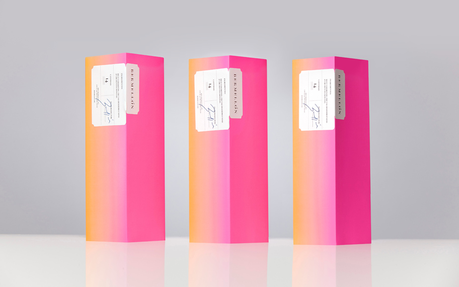
(1) I think this year I’m going to break all the rules and just go with what I like. Be it ‘Christmassy’ or not, I found this gradient packaging from Anagrama absolutely beautiful. The fluro colours would definitely brighten up a Christmas morning.

(2) They reminded me of some packaging I saw on Mr Printables, which has stuck in my mind for a while. Mr Printables is a great site to download printables for kids to make and do. I thought these ombre printable sheets of wrapping paper would make lovely Christmas wrapping, and the soft gradient teamed with a black ribbon really completes the look. I also loved these printable ombre gem stone like shapes, which are actually meant to be built as an advent calendar. Such a good idea!

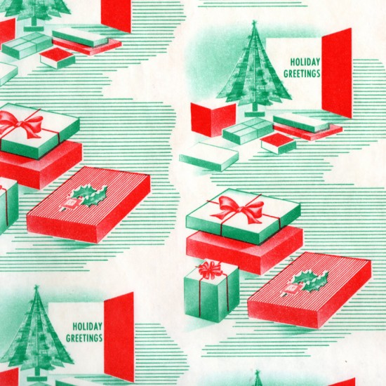
(3) Present & Correct is one of my most adored Design Blogs and has been for years. One of their specialities is putting together collections of fabulously designed items; and while cruising around looking for packaging, I saw their compilation of vintage Christmas patterns. These are so beautiful from the simple shapes and lines using just a two colour pallette. Very different from what I was looking at previously, but adorable all the same.

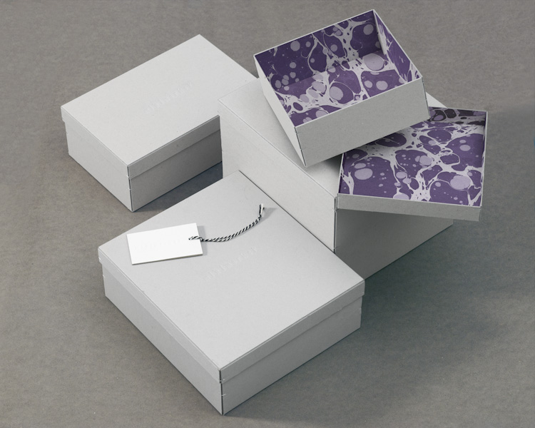
(4) Sticking with pattern, these boxes from the Swedish Design Studio 1-2-3 caught my eye. I love how simplistic and clean the outside of the box is, teamed with the unexpected marble pattern of the lining inside. This pattern reminds me of the kind of shapes brian scan’s show, and almost have an oil-type appearance.

(5) This packaging design by Happy F&B is much more hard hitting and in your face. I absolutely love the colour combination, and the use of corners and edges. They are mesmerising to look at, and If I received a gift in one of these, I would be just as excited for the packaging than what’s inside.


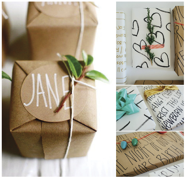
(6) As a final thought, if all else fails and you’re a bit skint – DIY! These are a classic snapshot of Pinterest type pictures, I’m a mega fan of brown paper anyway, so to use it used in this way makes it look rather special. Hand drawn typography makes the gift look even more special, and who would have thought sellotaping a piece of tree to a present could make it so festive!